What
Mobile app redesign for a public research university, serving 34,000+ students, focused on improving student onboarding and access to campus resources.
Project Outcomes
- Created a long-term usability strategy, including a phased testing plan.
- Modernized the look and feel of the interface.
- Increased traffic and task completion success.
- Created a reusable UX research library to guide future iterations.
My Role
- Project Lead
- Usability Research
- UX/UI Design
Team
- 1 UX Designer
- 3 stakeholders

UX Strategy is a Must

The redesign wasn't a single release but a structured UX evolution. Each research phase informed prioritized backlog items for upcoming development sprints.
Project Goals
- Improve findability and navigation for core student tasks.
- Increase adoption during onboarding and key academic moments.
- Establish a repeatable research and testing loop for future releases.
Aligning with the Product Team

Sharing early artifacts with the product team helped align expectations and speed up decisions.
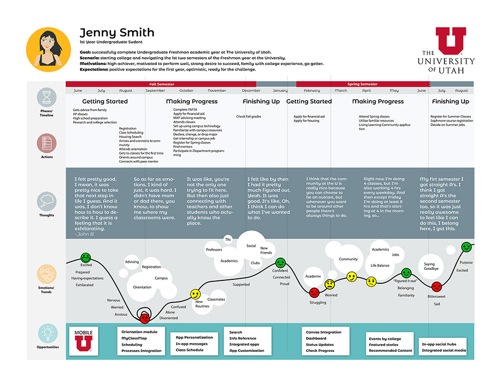
I've established regualar communications for presenting findings and to show ongoing UX validation. Deliverables included:
- Personas
- Journey Map
- Usability Testing Reports
Image: A Journey Map created using input from staff and advisors.
Planning Usability Testing

To guide the redesign, I planned and conducted a three-phase research cycle to iteratively evaluate the app's usability and navigation:
- Round 1: User interviews with interactive prototypes to collect baseline impressions and pain points on app layout and hierarchy.
- Round 2: Card sorting to help refine information architecture.
- Round 3: Tree testing to evaluate revised navigation structure for key task pathways and identify improvements.
- Round 4: Sandbox app build validation with students via interviews.
The Benefits of a Iterative Testing
An ongoing, cyclical testing process helped set a usability baseline and create a long-term roadmap for improving the app. Each round of research revealed issues early, guided better design decisions, and built a reusable framework for future studies.
Do the Students Love the New Look?

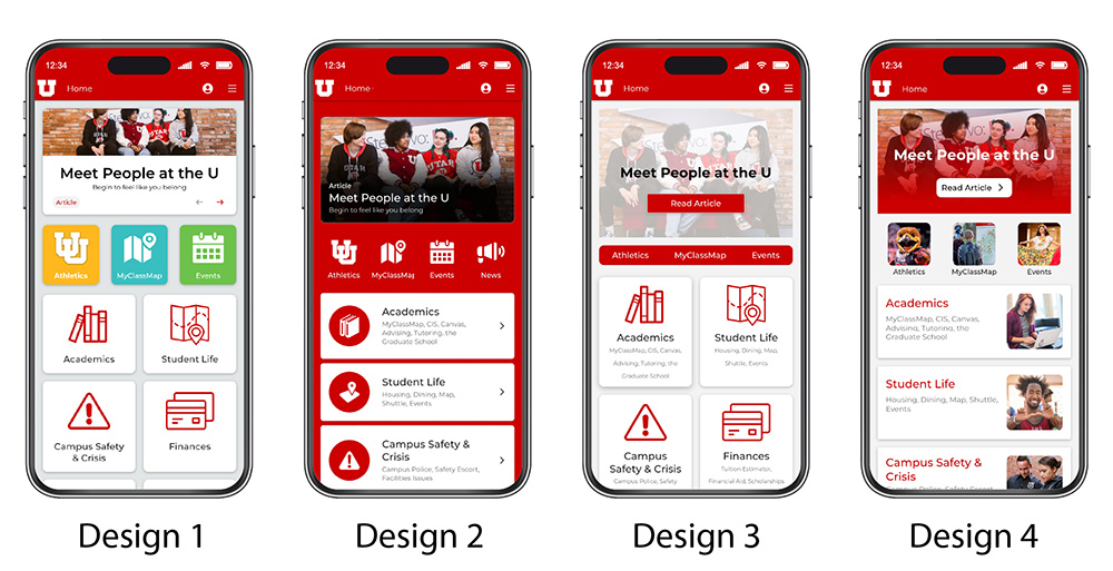
I used Adobe XD prototypes to engage students and capture actionable feedback about the new design concepts:
- Home screen banner designs
- Tile styling and layout
- Quick links design
- Layouts for third and fourth-level screens
After receiving positive feedback about the overall design direction and felt confident to move forward.
Asking students to test with realistic tasks proved key in getting relevant feedback.
Find Athletics information and upcoming events.
Navigate to class map and look up class location.
Locate information about getting involved in students organizations.
Access Canvas/Email from the app.
Find campus support services contact information.
Navigate to parking and transportation info.
A Clear Pathway for Improvement
The study findings provided a very clear picture of the exiting issues, desired features, and specific actions for improvement.
Home Screen
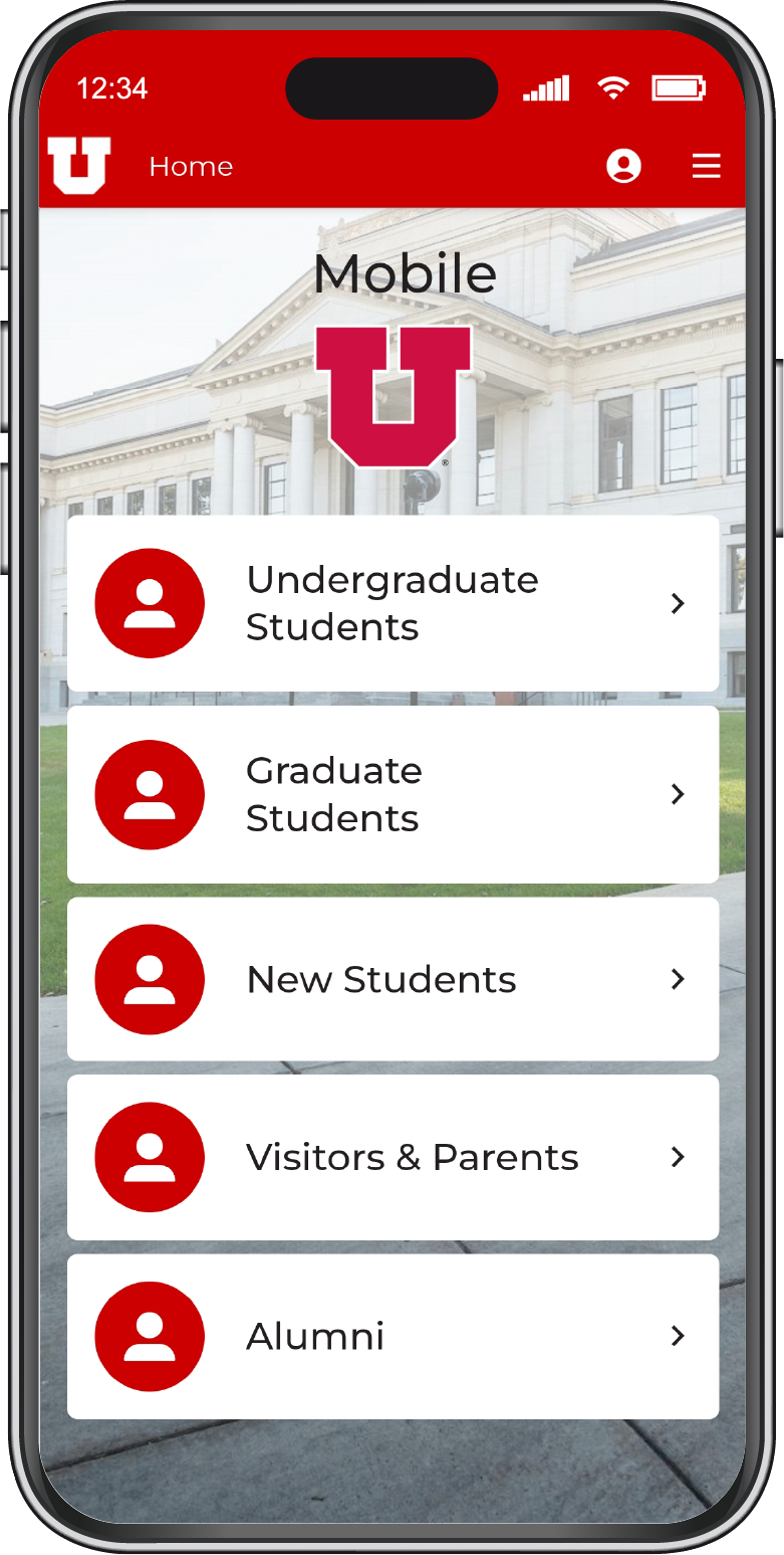
Key links existed but priority items were not prominent. Some sections lacked clear actions. Several high-value tools were missing from the top level.
Navigation
Labels and groupings did not match student expectations. Redundant links and inconsistent pathways created extra taps.
Content
A lot of content was outdated or inconsistent with other university websites, which increased search time.
Design & Usability
Brand alignment was good, but hierarchy and affordances needed clearer signals for tap targets.
Taking Action on User Feedback
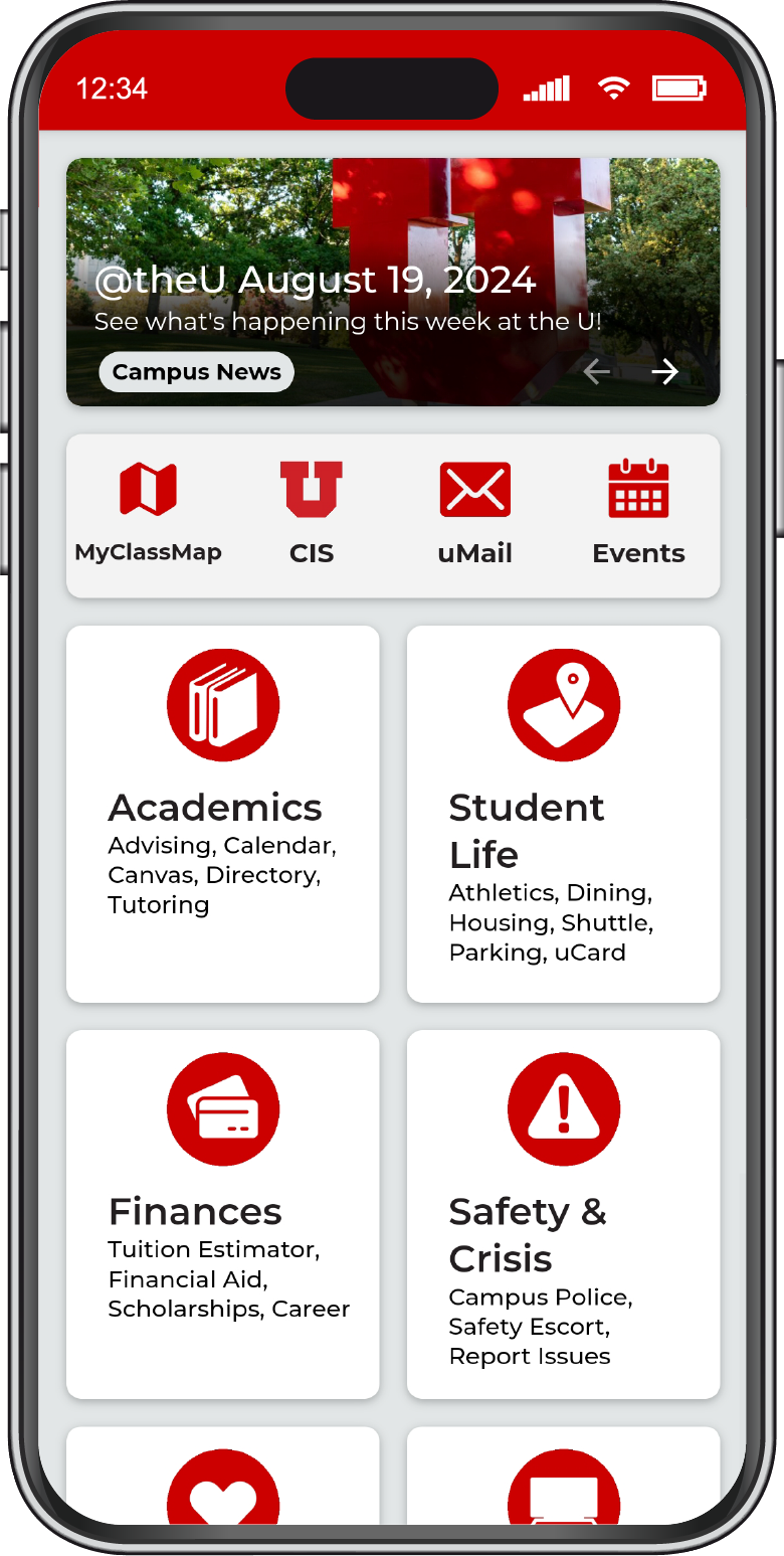
Surfaced Maps, Classes, Events, and Athletics on the home screen.
Consolidated redundant sections and links.
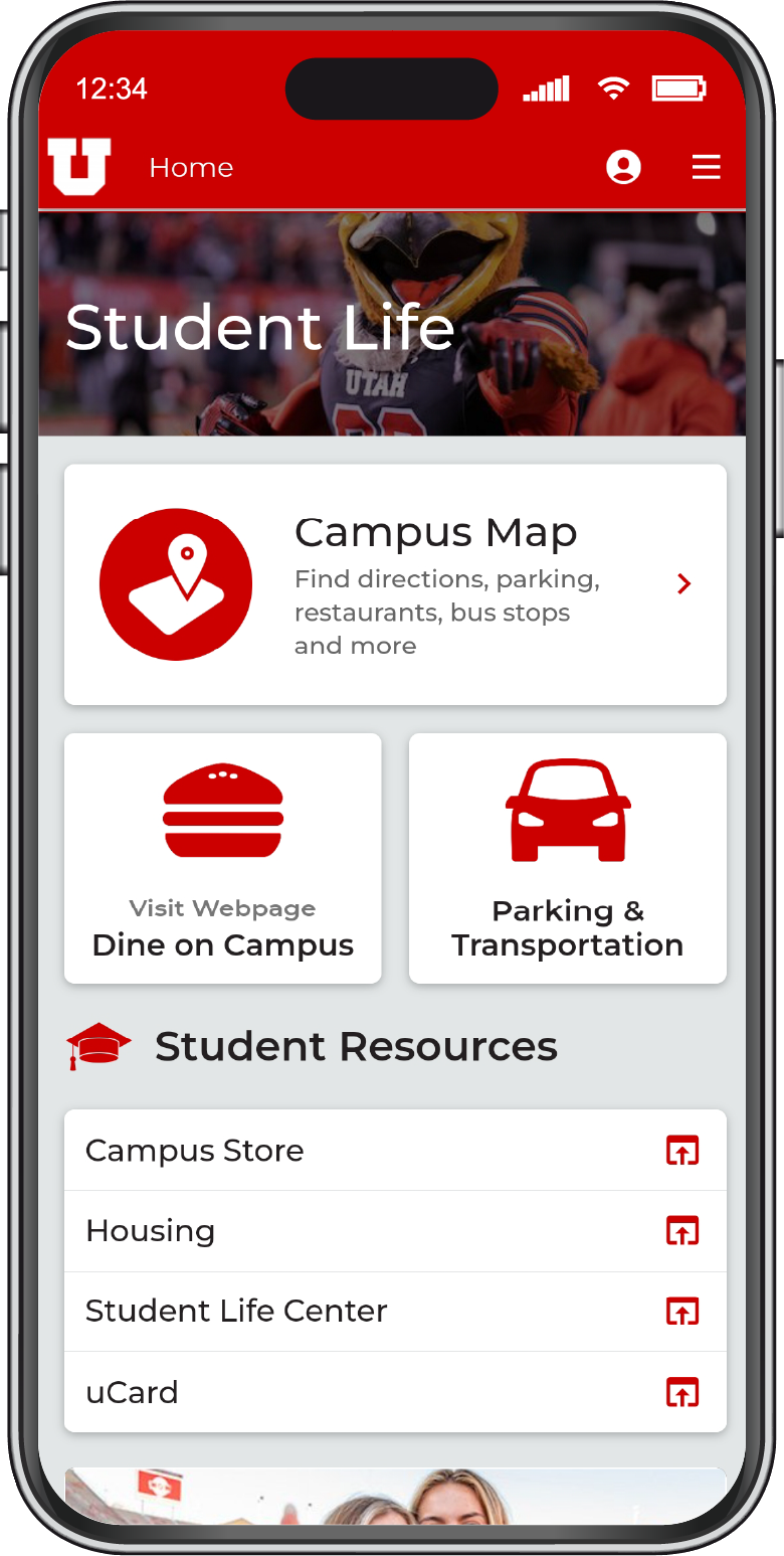
Used plain labels that match student language.
Streamlined primary flows and reduced taps to key actions.
Fixed critical visual affordance and hierarchy issues.
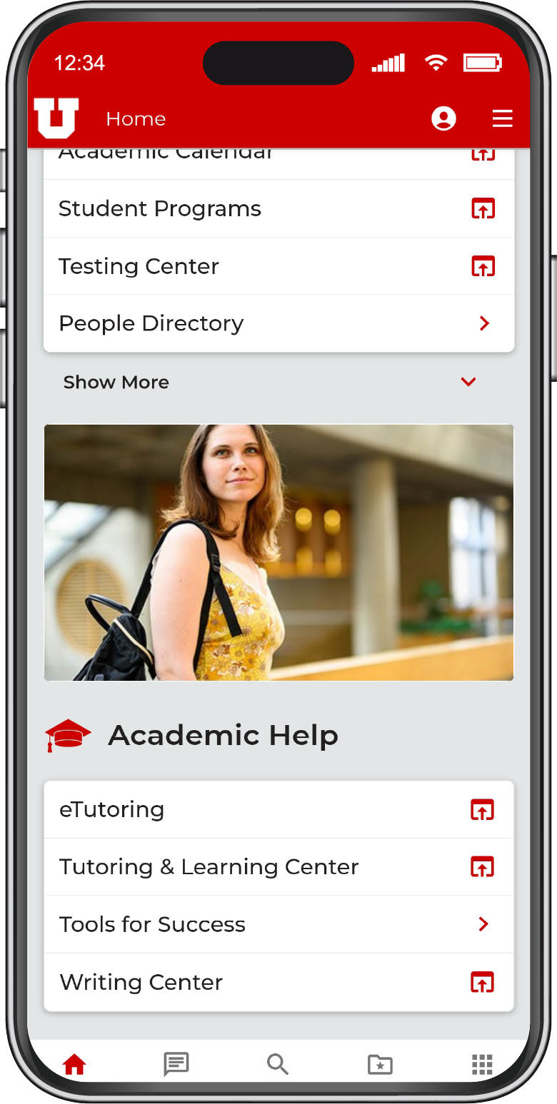
Added search capability in the app.
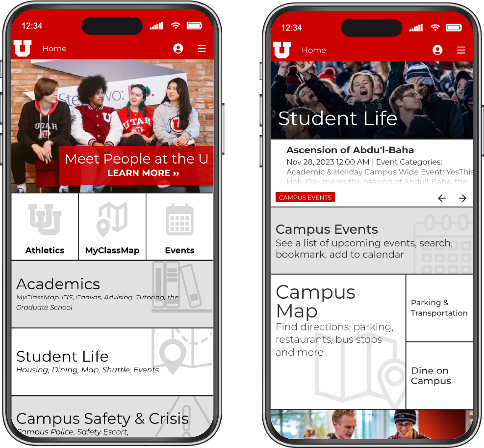
Mobile Experience Re-invented
The redesign simplified navigation, modernized the interface, and stayed true to university branding. High-value features were surfaced, while clearer layouts and labels made the app more intuitive and student-friendly.
What We Achieved
Higher
Usage of key features
More
Positive user feedback
Faster
Task completion
Strategic and Organizational Outcomes
The project established a repeatable, research-driven testing cycle and a UX research repository to guide future updates. It integrated usability metrics into sprint planning, strengthened collaboration across teams, and encouraged data-informed decision-making for the university’s mobile experience.
