Client
An urban academic library, serving 45,000+ students.
Problem Statement
Students who are novice library users need to successfully and independently navigate the library’s physical space so that they can accomplish key tasks required to make them successful in their studies.
Outcomes
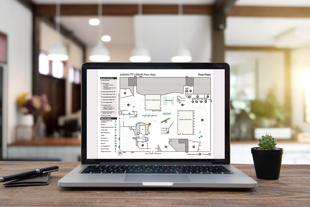
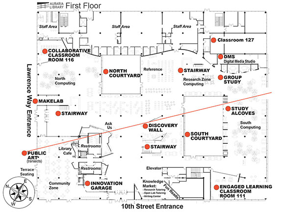
The new on-brand map design helps users to be able to easily locate the library spaces, office areas, emergency exits, and amenities without overwhelming them with too much detail.
My Role
I worked on the visual elements of the map available for print. I worked on a team of 3 people and contributed to researching interactive maps, creating visual design, conducting user testing, carrying out drop in testing with staff, creating storyboards, and optimizing the PDF for the screen readers.
Project Background
Through past user surveys the team has learned that wayfinding inside the library building has consistently been a challenge and it was difficult for the users to complete key tasks using the existing library map. This led to the design and development of an interactive library map to help users find their way inside the library.
Learning from Successful Map Designs
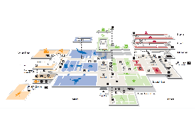
The team looked at examples of maps around the web to get ideas for the elements to incorporate into the new design. We observed what we liked and did not like about each design to learn how other maps deal with displaying non-public space, providing rich information, icons, and staying on-brand.
Solving Design Problems
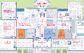
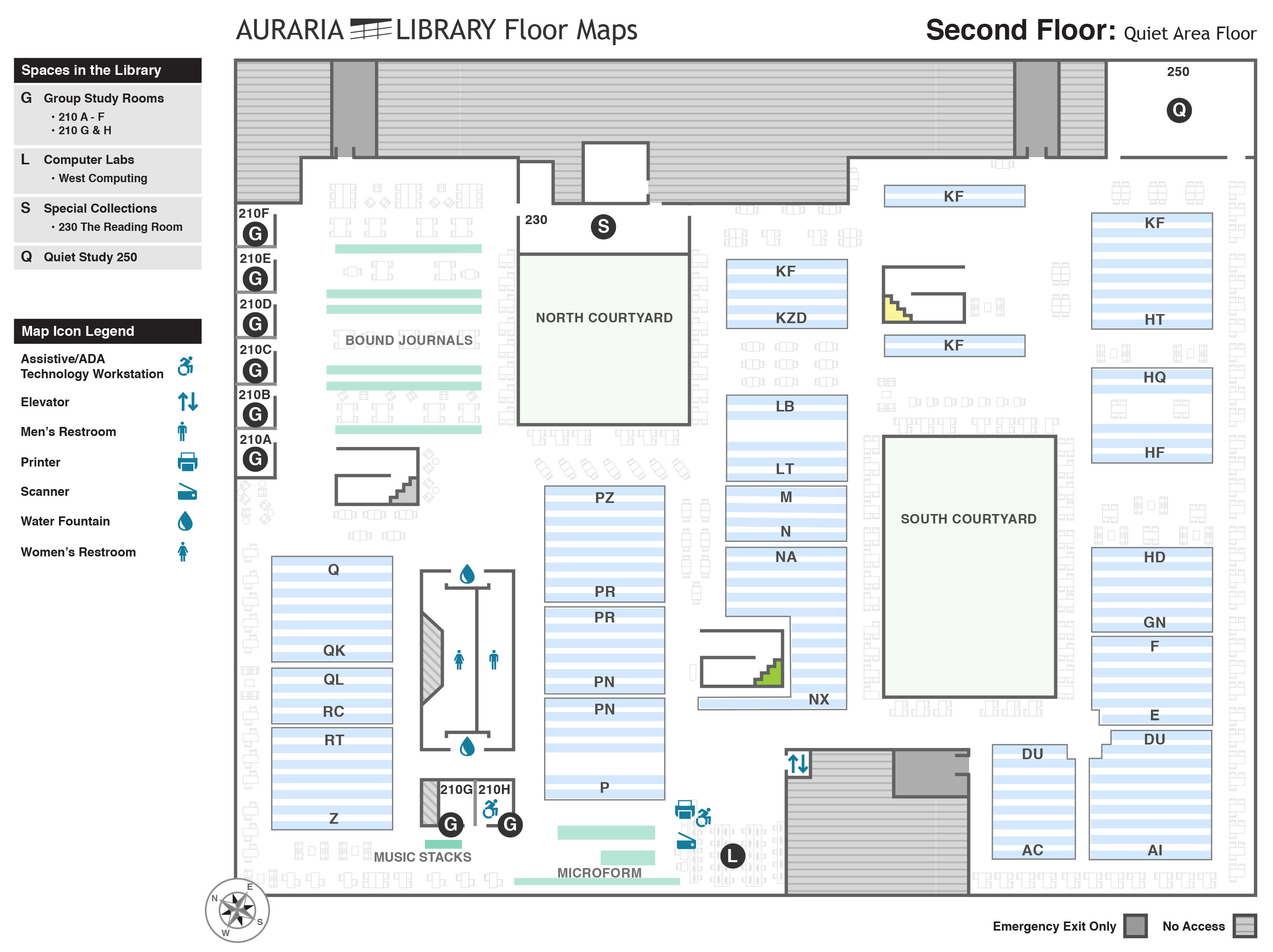
In the old map design did not label book stacks, office areas inaccessible to patrons, group study rooms, and amenities. The team collectively worked out the visual design of the new map to solve these problems. I worked on the amenities icons, office areas, legend, 2nd floor stacks, and the overall visual style.
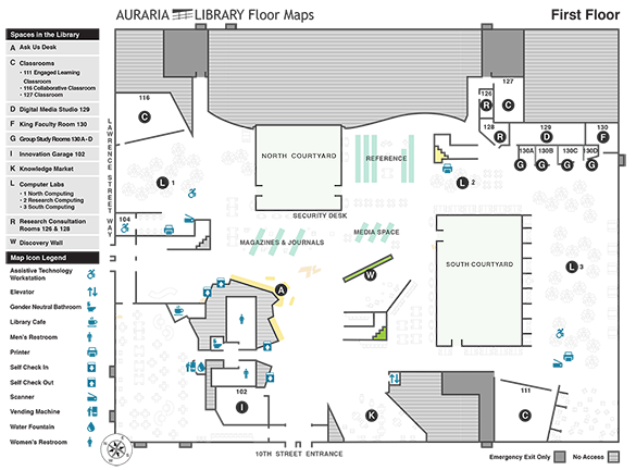
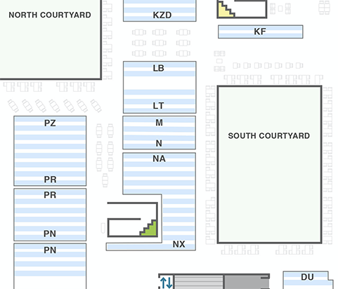
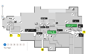
Designing 2nd Floor Map
I needed to display book stacks without overwhelming the users with too much detail. I opted out for providing multiple visual clues to help users locate books:
- I divided the stack areas into visual sections.
- Each stack location is accurately marked.
- I added book call numbers to the sections.
This design was informed by how other libraries display their books stacks.
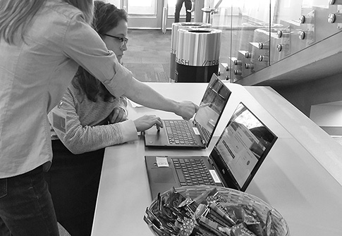
User Testing
Once the interactive prototype was developed, I assisted in designing and carried out a guerrilla user testing with students. It helped to inform the design and identify issues before they went into production.
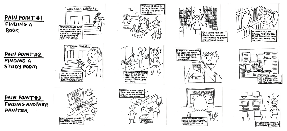
The team has collectively identified 3 user pain points. We used these pain points to design the user tasks for testing:
- Pain point #1: finding a book
- Pain point #2: finding a study room
- Pain point #3: finding another printer
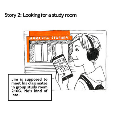
Storyboards
I created storyboards and used them to help staff to become empathetic towards our users during drop-in user testing with library staff. The aim was to demonstrate the three wayfinding user pain points that we have identified.
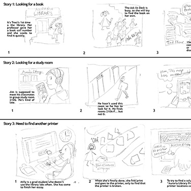
Storyboards Process
The team members brainstormed the scenarios for each storyboard together. I created a rough mock-up with wording for each scene. I wanted to use a highly detailed style of artwork for the final product, but after discussing it with the project lead, I understood that a simpler style would be able to communicate what we needed just as well.
Final Design
Lessons Learned: Team Work
This project has taught me the importance of being a responsible team member. I learned that I must adhere to a timeline through managing my own time effectively and to be accountable for the tasks assigned to me.