Client
An urban academic library, serving 45,000+ students.
Problem Statement
A student researcher needs a quick and direct way to find content on the library website so that they can obtain key information that they are looking for and keep their focus on other tasks related to their studies.
Outcomes
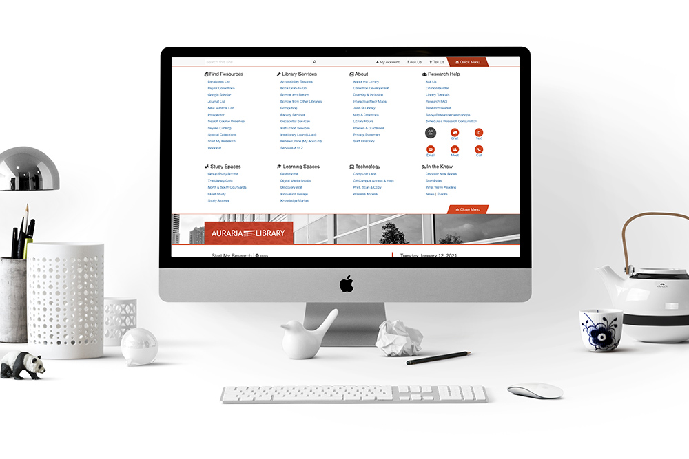
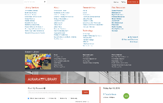
The new global menu features a “bird eye view” of the content and eliminates intermediate landing pages, saving clicks for the user.
My Role
For this project I was part of a team of 4. My contribution consisted of developing design and interactive prototype of the early menu idea, leading a Focus Group with staff, conducting User Testing, creating high-fidelity mockups, and cross-browser testing of the final prototype.
Project Background
In a previous survey we received user complaints that the menus were too long and too cumbersome to browse through. Users had difficulty finding the pages that they needed and the key content was buried in the intermediate landing pages.
Finding information about library services is essential to the success of the website, so we decided to re-design the main navigation.
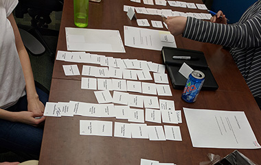
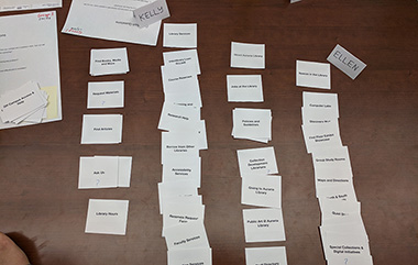
Focus Group with Staff
We began by showing early ideas to a group of students and staff. I assisted in designing and led a focus group with staff. Another team member conducted a focus group with student users. The staff focus group included interviews, interactive prototype, card sorting, and page priority exercises.
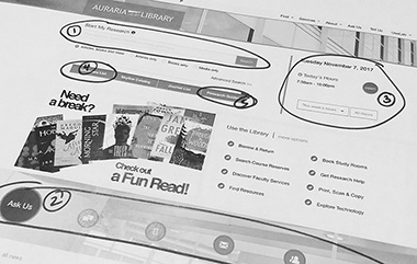
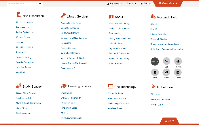
Early Prototype Design
I worked on creating the look and functionality of an interactive Prototype “A” for user testing with students and staff. Prototype “B” was created by another team member. The prototype I worked on featured:
- Bright orange menu button to catch a user’s attention
- A “fly down” menu animation
- A two-tier design with a darker section
- Important links section for quick access to essential links
5 Minute User Testing
When we had our two prototypes ready, we designed and carried out user testing with the students. One of the constraints was that the students were always on the go, so I found a research method that was quick and easy. The method was inspired by Zoe Chao’s presentation at the Lita Forum - "Designing 5-minute UX Studies" and it worked well for our students who are always on in a hurry.
I carried out the user testing with another team member. The aim of the study was to learn the following:
- Confirm that the button label “Quick Menu” makes sense to users
- Make sure users can successfully browse and find information
- Catch any design and usability issues with the prototype
- Have users select one design to provide us with a direction
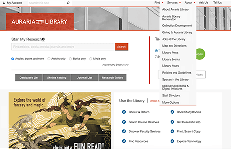
High-fidelity Mockups
Next I worked on high fidelity mockups of the menu using Adobe Illustrator. Users liked some elements from Prototype “B”, so the team decided to include them into Prototype “A”:
- We increased the line spacing between text.
- We added icons to categories.
- We removed the dark section because users did not notice it.
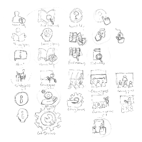
Sketches and Design Variations
One of the features the students was icons. So, we worked on designing icons to best represent and communicate the categories of the menu. Some icons were a custom design and some were taken from Zurb Foundation Framework. I sketched to brainstorm ideas for the custom icons and went through a process with the team to discuss which worked best for the categories.
Final Design
Lessons Learned: Design is Never Complete
One of the things that I have learned, is that a design is never complete and new feedback may uncover new issues or approve/disprove a hypotheses. For example, having run the Google Analytics click tracking for 1 year, we have noticed that some sections of the menu do not get used and users complain of the menu being too overwhelming in spite of the fact that during the user testing, users preferred a more comprehensive design.